
- EchoDraws
- Handsome Prince
 Offline
- From: Capricorn House in Sanctuary
- Registered: 3/27/2020
- Posts: 2,628
Re: An Amateur Artist's Art Array ~ Specter's Art Collection
<3 y e s
Echo
He/Him xe/xem
AAAAAAAAAAAAAA
- Time
- Moderator
 Offline
- From: Loserville
- Registered: 3/28/2020
- Posts: 4,240
Re: An Amateur Artist's Art Array ~ Specter's Art Collection
coffee at 3 am? She's never going to get a good sleep schedule!
Time.
Originally from WoFMB
- SpecterTheGreat
- Moderator | Ghostly Being | 👻👻👻
 Offline
- From: A ghost town
- Registered: 3/27/2020
- Posts: 4,991
Re: An Amateur Artist's Art Array ~ Specter's Art Collection
@Autumn
Hey thanks! I put a good amount of effort into the hair xD so I'm glad to know you like it.
@Echo mmmm coffee
@Time
She doesn't have one really to begin with ![]()
Specter | <<#CCsurvivor>>
- •
- SpecterTheGreat
- Moderator | Ghostly Being | 👻👻👻
 Offline
- From: A ghost town
- Registered: 3/27/2020
- Posts: 4,991
Re: An Amateur Artist's Art Array ~ Specter's Art Collection
Day two of Sketchober: Direction
A bit of an abstract interpretation here xD
To be honest I didn't know what to do for this prompt, so I decided that a compass rose charm could represent "direction".
I tried a little bit of realism Ig? It's my hand xD though it's not a super good hand because it's supposed to be bent back in the middle and I wasn't able to reflect that in the paper (which is why the thumb looks long).
But I'm kinda happy with the result. I tried to apply the basic light/shade theory I've seen in my pencil drawring course so far.
It's also my first time drawing a realistic hand,,, so... xD
Specter | <<#CCsurvivor>>
- •
- SpecterTheGreat
- Moderator | Ghostly Being | 👻👻👻
 Offline
- From: A ghost town
- Registered: 3/27/2020
- Posts: 4,991
Re: An Amateur Artist's Art Array ~ Specter's Art Collection
Day three of Sketchober: Heart
I used a base as reference.
It's not against the rules xD and I make the rules anyways haha I AM THE RULES and it's a sketch anyways. I thought the base looked really cute there ![]()
I used the heart shape for the prompt instead of the actual human heart (which was an idea that crossed my mind, to make something actually related to the heart) and I think it looks nice!
The lines are simple and not really shaded or anything. I'm actually considering the idea of coloring it, but Idk.
Specter | <<#CCsurvivor>>
- •
- Time
- Moderator
 Offline
- From: Loserville
- Registered: 3/28/2020
- Posts: 4,240
Re: An Amateur Artist's Art Array ~ Specter's Art Collection
I bet echo would've used an actual heart
Time.
Originally from WoFMB
- EchoDraws
- Handsome Prince
 Offline
- From: Capricorn House in Sanctuary
- Registered: 3/27/2020
- Posts: 2,628
Re: An Amateur Artist's Art Array ~ Specter's Art Collection
@Spec- So cute!!!!! I love her and would die for her
@Time- I'm mad because you're absolutely right I would have made gore
Echo
He/Him xe/xem
AAAAAAAAAAAAAA
- SpecterTheGreat
- Moderator | Ghostly Being | 👻👻👻
 Offline
- From: A ghost town
- Registered: 3/27/2020
- Posts: 4,991
Re: An Amateur Artist's Art Array ~ Specter's Art Collection
@Time
I feel that's accurate xD
@Echo
(:<
Glad to know that! I love her too; she's super cute!
Don't give me more ideas ![]() I have enough planned for her already
I have enough planned for her already ![]()
Specter | <<#CCsurvivor>>
- •
- SpecterTheGreat
- Moderator | Ghostly Being | 👻👻👻
 Offline
- From: A ghost town
- Registered: 3/27/2020
- Posts: 4,991
Re: An Amateur Artist's Art Array ~ Specter's Art Collection
Colored version!
Honestly, she just looks so adorable! I love her design xD it's supposed to be bright and lively. Just like her name! Vida.
Alright, well, I think I did nicely with the lineart. And the coloring is not bad. It's my first time inking and coloring a piece in this sketchbook's paper, so yup.
She is supposed to be a bit paler than that, but hey xD minor error. Her hair too. It should be a stronger orange color, not as light/yellowish as I actually colored it. The flowers aren't really supposed to stand out btw; they're a part of her hair and therefore have the same color. Now, the original idea for her hair color was the scheme of a bright flower petal wilting at the tip. Ik that's a weird concept xD but it's supposed to be reflected in her hair being bright orange and a duller brownish in the tips. I don't do color gradients very often and imo it shows :'D but I tried.
Ah yes, and her hair "shape/flow",,, it didn't come out as nice as I wanted it to. It shouldn't be THAT stringy, but it does need to have volume. I'm just making design complicated for myself xD
Now, the clothing is o-k. I didn't add many clothing folds hehe. The coloring is also nice. Was a bit tricky to shade the white, but I did something.
Then... I think that's p much all I have to say ab this?
Specter | <<#CCsurvivor>>
- •
- EchoDraws
- Handsome Prince
 Offline
- From: Capricorn House in Sanctuary
- Registered: 3/27/2020
- Posts: 2,628
Re: An Amateur Artist's Art Array ~ Specter's Art Collection
HHHHHHHHHHHH <3
Echo
He/Him xe/xem
AAAAAAAAAAAAAA
- Nightseeker
- Industrial Designer
 Offline
- From: Crossroads of America
- Registered: 8/05/2020
- Posts: 289
Re: An Amateur Artist's Art Array ~ Specter's Art Collection
SpecterTheGreat wrote:
Alright, I'm posting this full-size because I'm lazy. I used a base for this so xD laziness x2.
Her name's Yvonne, and she's a lazy (like I!) mage who loves to sleep, and loves her pillows.
UwU.
( I know it's from 4 months ago but no one made the joke so)
HI I'M MIKE LINDELL-
NIGHT
of the WoFMB
obsessed with trains, trucks, tractors, the like
actual farmer, 500 acres
CEO of WoFRR
JOHN DEERE IS BEST
"tractors, plows, with flashing lights"
MAGA
- SpecterTheGreat
- Moderator | Ghostly Being | 👻👻👻
 Offline
- From: A ghost town
- Registered: 3/27/2020
- Posts: 4,991
Re: An Amateur Artist's Art Array ~ Specter's Art Collection
A bunch of my drawings here don't load. Apparently bc of security issues?
Anyone else having the same issue or is it just my devices?
EDIT: They're working now again dw
Last edited by SpecterTheGreat (10/13/2020 12:28 pm)
Specter | <<#CCsurvivor>>
- •
- Time
- Moderator
 Offline
- From: Loserville
- Registered: 3/28/2020
- Posts: 4,240
Re: An Amateur Artist's Art Array ~ Specter's Art Collection
Nightseeker wrote:
( I know it's from 4 months ago but no one made the joke so)
HI I'M MIKE LINDELL-
INVENTOR OF MYPILLOW
Time.
Originally from WoFMB
- SpecterTheGreat
- Moderator | Ghostly Being | 👻👻👻
 Offline
- From: A ghost town
- Registered: 3/27/2020
- Posts: 4,991
Re: An Amateur Artist's Art Array ~ Specter's Art Collection
I'm sorry I'm uploading Day Five before Day Four :') but I really wanted to share this.
The image is a bit blurry and dark, so yep, the graphite is crisper on paper.
I have to admit I didn't really know what to do for the "sepulchre" prompt. So, I drew this girl as how she looks inside hers when she's dead. She's an OC and I uploaded design pictures of her on my GGaD art thread several months ago, so some of you might have seen her before.
She has a name but I always forget it xD I've been calling her "One Dead Girl" for so many months now... ![]()
ANYWAYS!
I know the piece itself isn't one of my best works in term of style (proportions lol) BUT I am very proud of how I managed the pencil coloring. I think I'm kinda getting the hang of it :D and I need to get better at drawing flowy hair, but I tried to do a nice lighting on black. I like her hair style xD even though it's impossible for any real person to style it like that.
I also like her clothes' design. It was tricky to do it in a way it would seem that she is actually lying down. Which takes me to the background thing. It's supposed to be a cloth of sorts with flowers here and there. So uhhhh I tried to do the folds to increase the "bed" effect, but I still need more experience with it lol.
The posing was a bit tricky since it's not only a pose I have not done before, but I also did it at an angle and it threw me off a bit. I like the result, even though her body didn't come out symmetrical :'). Her hands are a little too long too lol. Idk about the arms. They look a little weird but I can't figure out what is the cause of that.
Also, I had a bit of trouble with making her expression as neutral as possible. It should look relaxed and like she's resting. The nose,,,, I am currently Struggling with noses.
Well, what do you think? Does she look dead enough?
In general, I'm proud of this piece even if it isn't the best. I think it shows I am slowly improving.
Specter | <<#CCsurvivor>>
- •
- Time
- Moderator
 Offline
- From: Loserville
- Registered: 3/28/2020
- Posts: 4,240
Re: An Amateur Artist's Art Array ~ Specter's Art Collection
"how she looks inside hers when she's dead."
What??
Anyways rip ;-;
Yeah I noticed that with your noses, it seems mostly that nose is kinda for 3/4 views primarily, maybe you need to create a nose that fits front drawings better?
Time.
Originally from WoFMB
- EchoDraws
- Handsome Prince
 Offline
- From: Capricorn House in Sanctuary
- Registered: 3/27/2020
- Posts: 2,628
Re: An Amateur Artist's Art Array ~ Specter's Art Collection
I agree with Time on the nose but the graphite looks really good to me
I think the proportions look good but I also cannot proportion to save my life so you should probably ignore me lol
Echo
He/Him xe/xem
AAAAAAAAAAAAAA
- SpecterTheGreat
- Moderator | Ghostly Being | 👻👻👻
 Offline
- From: A ghost town
- Registered: 3/27/2020
- Posts: 4,991
Re: An Amateur Artist's Art Array ~ Specter's Art Collection
@Time
How she looks inside her sepulchre whenever she's dead. I mean, the prompt was sepulchre, so I had to do something related to that.![]()
Ah, yes. I should probably continue figuring that out xD. Any suggestions?
@Echo
Thanks!
xD Proportions are a true struggle
Specter | <<#CCsurvivor>>
- •
- SpecterTheGreat
- Moderator | Ghostly Being | 👻👻👻
 Offline
- From: A ghost town
- Registered: 3/27/2020
- Posts: 4,991
Re: An Amateur Artist's Art Array ~ Specter's Art Collection
Newest work with Medibang Paint! I love the program sm omg.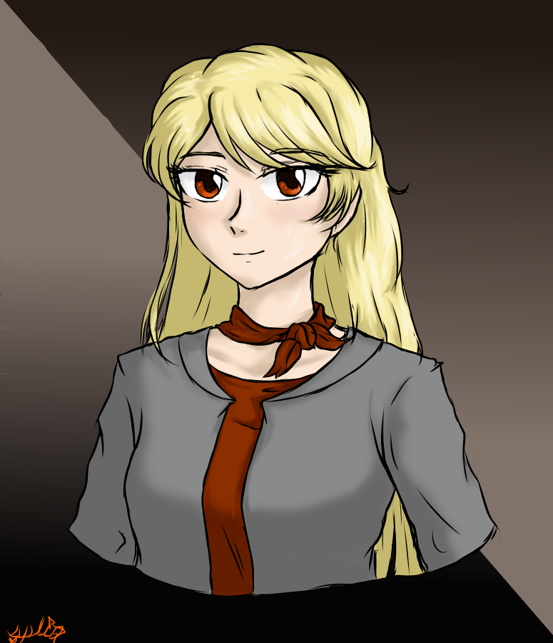
I was going to put a long description here but I forgot everything I wanted to say xD
Anyways, I really like the default tools. It makes digital drawing SUPER easy.
The girl in the pic has a name btw. She's Amande :D.
Anyways, most of this was testing out new tools since I'm still getting acquainted with the program. I hadn't discovered the clipping layers option yet xD so I spammed layers and had like triple work for shading ![]() .
.
THe gradient tool is wonderful!!!! Look at the background. Simply amazing.
Specter | <<#CCsurvivor>>
- •
- SpecterTheGreat
- Moderator | Ghostly Being | 👻👻👻
 Offline
- From: A ghost town
- Registered: 3/27/2020
- Posts: 4,991
Re: An Amateur Artist's Art Array ~ Specter's Art Collection
So, lately, I mentioned something about my participating in an art contest.
The main idea of that art contest was to raise awareness about the COVID-19 situation in the country. The theme to work with was "Real Life Heroes".
This here is what I've submitted.
I titled it "Todos Somos Héroes" (We Are All Heroes). Maybe it's a bit of a cliché title, but it's really what I wanted to show.
See there? This is in honor of everyone who is involved with the pandemic in some way. The policeman at the lower left, the cheerful cashier above him, the mourning/praying girl at the top, the delivery man at the top right, and the student who stays at home in the lower right.
And, of course, the doctor in the center. In my opinion, doctors are the ones who deserve the most recognition during these trying times. The world is before her, and she stretches out her hands to protect it, backed up by all the others who will cooperate for a better future.
If everyone does their jobs, they can be heroes.
That's the message I want to convey. Call it cheesy or anything xD I'm not very good with symbolism or even expressing what I think. But the intention is there.
Now, going a bit more into the art aspect of this piece.
I am extremely proud of it. It's the largest work I've done in a very long time. But it was worth it, all the effort I put into it was worthy. I like the result even if it's not as good as I had envisioned it in my mind.
I poured out all of my available art skill into doing this. So, the errors visible are simply because my art skill levels are not high enough yet. But that's why I draw. Someday I'll be able to art so well that I shall be able to convey messages easily through my art.
Meanwhile, I practice. And I try.
As you can see, I used colored pencils. It was a challenge tbh xD as I am still learning how to manage the hues and blending and all that. But I'd dare say that I did a decent job. Right?
Also, the designs for the people depicted there are random. I came up with them on the spot but anyways I like how they look.
In general, I tried to make the people seem Peruvian xD but that didn't come out too well. So yes, they're all supposed to be Peruvian, but I wasn't really able to make them look like that as much as I would have liked.
For this piece, I don't really want to focus on where I messed up and where I went wrong. I'm just giving my thoughts because I feel that, especially here, the intention is what counts.
We all know I'm an amateur, and that isn't what I want people to focus on while reading this description.
Still, I would be delighted to hear your thoughts! With so much effort into this, ![]() , I want to see others' reaction(s).
, I want to see others' reaction(s).
Specter | <<#CCsurvivor>>
- •
- autumnlibrarian16
- Mage
 Offline
- Registered: 7/06/2020
- Posts: 442
Re: An Amateur Artist's Art Array ~ Specter's Art Collection
That looks amazing!! The facial expressions and the people look great as always, but as an entire composition, the piece is fantastic! You've filled up the entire page yet left just enough white space to keep the page from feeling too crowded
The hair and the folds also really shine as in they look really natural - your coloring is as beautiful as ever
Your choice of putting the doctor in the center was one that I definitely liked, and it was really neat to read through your rationale for your drawing
Good luck with the competition Specter!! Your effort is really apparent, I hope they recognize your work :D
Autumn (Librarian)
she / her | kinda a nerd
hello :D hope you're having a good day
"The true sky, and songs that cageless soar
Were they not wishes worth fighting for?"
- SpecterTheGreat
- Moderator | Ghostly Being | 👻👻👻
 Offline
- From: A ghost town
- Registered: 3/27/2020
- Posts: 4,991
Re: An Amateur Artist's Art Array ~ Specter's Art Collection
@Autumn
Hey hey, thanks! :D
I'm glad to lnow you liked it ^_^ and also to read your thoughts about it. It makes me happy when i can know what the viewers think about aspects of my art :3. So thanks for the comments!
I, unfortunately, did not win, but simply participating was a big treat for me! I must say that the winning piece was absolutely beautiful. Either way, I am content that I managed to create a good piece of which my parents can be proud too.
We'll see, maybe in the future I'll be able to do more inspirational art like this.
Now, back to practicing with my other art!
Specter | <<#CCsurvivor>>
- •
- SpecterTheGreat
- Moderator | Ghostly Being | 👻👻👻
 Offline
- From: A ghost town
- Registered: 3/27/2020
- Posts: 4,991
Re: An Amateur Artist's Art Array ~ Specter's Art Collection
Everyone's favorite RA fighter! Exspiravit!
Okay maybe not everyone's favorite xD but they're pretty cool. Even though they've only appeared once in the story for auditions, and two or three times as a civilian.
I can't wait for their debut battle! Riri said it'll be amazing and... and I CAN'T WAIT to read it XD. Anyways, I hope that the picture conveys their cool vibes.
Now, onto art talk.
I had lots of fun doing this even though the sketch was done really quickly and not much effort put into it. It's a new pose yep. I even dared try a little bit of foreshortening with the arm up there. And I referenced myself for the pose, so Idk. There are some errors but I think they aren't that noticeable. Like, the length of the fingers in the lifted hand.
Another thing of their design I'm not sure if I did correctly is the fact that they should look thin. I dunno how to do body shapes very well and in that pose I think it's not visible. I also forgot that they're a vampire so uh yeah their grin looks very human XD. I did try to make them look of ambiguous gender so :3 at least I hope I succeeded in that xD.
In general, I reallly like Exspiravit's design! It was fun to do. As always though, I didn't know what I was doing with clothes/the coat and I just kinda improvised for folds and shading and that stuff. I also had fun playing with the grays. They're warmer shades of gray so they won't break with the red color in Exspira's coat.
By the way, there's a lot of warm hues in the drawing lol. I might have overdone it xD with the background and all. The only cool color is the chain's cold gray metallic color. Everything else is is reddish-orange hues. I really found it extremely fun to toy around with colors! I think I'm finally gaining some understanding of color theory, but since it's not something I consciously think about a lot, I think it's finally becoming an instinct :D.
Anyways yeah! And I improvised for the background too. I love the gradient tool and I added some layers with strange properties (me here testing the limits of my program lol). Also, Idk if anyone's been noticing this but xD in my latest drawings I've been trying to do lineart that isn't black. Mostly in shades of really really dark brown. Here it's a very dark red instead :3. To add to the reddish tone of the drawing, y'know.
Hope you like it ![]()
Specter | <<#CCsurvivor>>
- •
- SpecterTheGreat
- Moderator | Ghostly Being | 👻👻👻
 Offline
- From: A ghost town
- Registered: 3/27/2020
- Posts: 4,991
Re: An Amateur Artist's Art Array ~ Specter's Art Collection
Drew a crystal shard thing (with a tutorial) and I decided to share.
Lately I've been testing out drawings of crystals xD but uhm I need practice. I think I'm confident enough to try to draw them by myself now tho.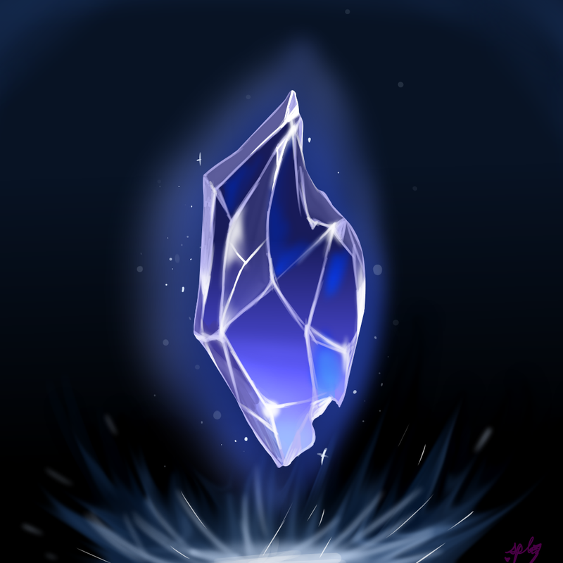
It's pretty imo so hahaha I'll probably be using it as a background for several drawings.
Specter | <<#CCsurvivor>>
- •
- SpecterTheGreat
- Moderator | Ghostly Being | 👻👻👻
 Offline
- From: A ghost town
- Registered: 3/27/2020
- Posts: 4,991
Re: An Amateur Artist's Art Array ~ Specter's Art Collection
See, I used it as a background for this! I posted the piece's lineart on my art discussion thread last week iirc, and here's the finished product.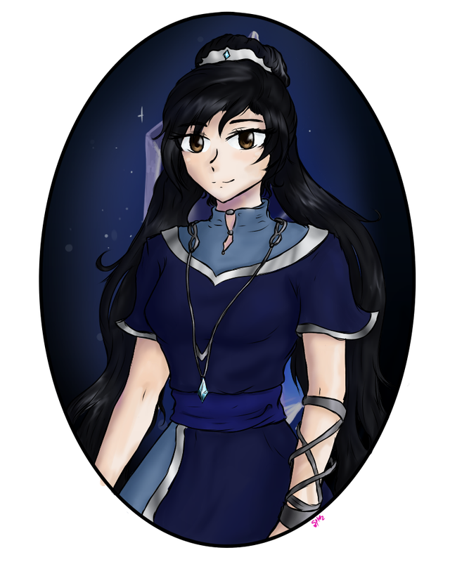
Well, I really like her design!
In terms of art, I have to say I changed my coloring style a bit. I used watercolor brushes for the shading, so you can see the effect achieved is somewhat different. For the skin, I discovered that's adding purple/blue to the shade gives it... an interesting effect.
I've also been training on how to shade/shine metals, so a good opportunity here to practice with the silver!
Specter | <<#CCsurvivor>>
- •
- autumnlibrarian16
- Mage
 Offline
- Registered: 7/06/2020
- Posts: 442
Re: An Amateur Artist's Art Array ~ Specter's Art Collection
That looks beautiful, Specter!! Even if it's different than your usual shading, it looks really good
The crystal background is also really pretty
Autumn (Librarian)
she / her | kinda a nerd
hello :D hope you're having a good day
"The true sky, and songs that cageless soar
Were they not wishes worth fighting for?"
"We came. We saw. We consumed your bread."
DISCLAIMER: We are NOT associated with Scholastic Inc.

